“Design is not just what it looks like and feels like. Design is how it works”
-Steve Jobs
Designing an app is a scientific process, one that involves a step by step approach. In this post, I will share the example-based app design process followed at Copper Mobile for the apps that we build. This blog can serve as a walk-through tutorial for anyone wanting to learn or brush up on the app design skills.
We will focus on “how and what of the design” and aspects to keep in mind while designing an app. Before we start applying the design skills, it is necessary to understand the product inside out, all required features and functionality. It is also extremely important to understand what the end-user would expect from the app in terms of functionality and usage.
Now that we know the pre-requisites, let us understand broadly, the design flow.
Design Process:
More often than not, the design process follows the following sequential flow.
- Creating the user flow for each screen
- Creating wireframes
- Choosing the design pattern, color and creating mockups
- Creating an app prototype
- Finalizing the touch ups to the prototype to get the final screens ready to begin coding.
Let’s code!!
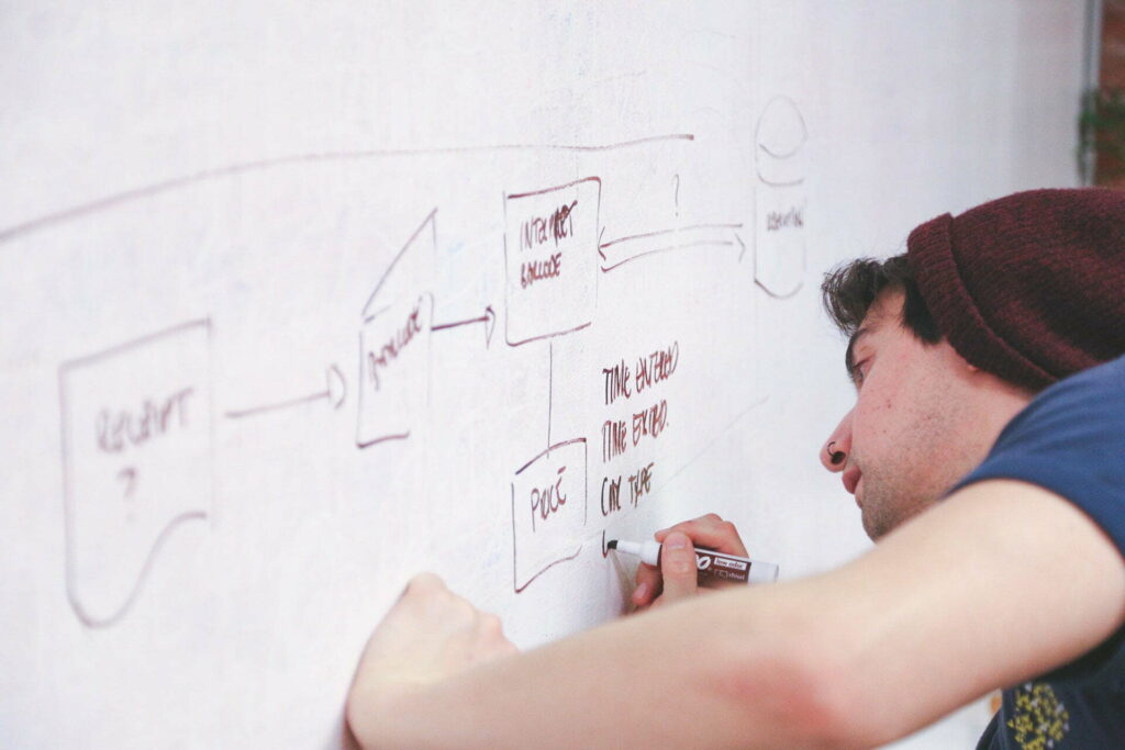
User-Flow Diagram
For successful implementation of the app, it is critical to figure out an exhaustive feature list for the app. Once that has been laid out clearly, one can begin with the user flow diagram, which is a high level, abstract representation of the users’ journey through the app.
Most commonly, 3 types of blocks are used to represent the elements of the user flow diagram, namely-
- Rectangles – to represent screens.
- Diamonds – to represent decisions such as tapping the login button, swiping to the left, zooming in.
- Arrows – to bind screens and decisions.
These diagrams give a visual representation of the overall app functionality and hence are a very useful tool in the design process. Here’s what a user-flow diagram may look like-

User-flow diagram for the Main Interface.
Wireframes
Once the use flow has been worked out, next step is designing the wireframes. Wireframes are a low-fidelity mock-up of how the final app will look like. They give a tentative positioning of features like images, labels, buttons.
Here’s a sample wireframe.

Design Patterns and Color Palettes
This step is usually the most exciting and creative as it allows the designer to experiment with lots of colors and design patterns. If you are like me, this would be your favorite part too. Its like window-shopping, making choices from a variety of design and color palettes. One can pick several options, and experiment with them till the most appropriate and visually appealing combinations is reached.
Mock-ups
This is the actual stage where the app finally takes shape and we move towards a high-fidelity representation of our design. This step yields the actual look and feel of how the app will appear and function when fully developed. It should look realistic and like the real app.
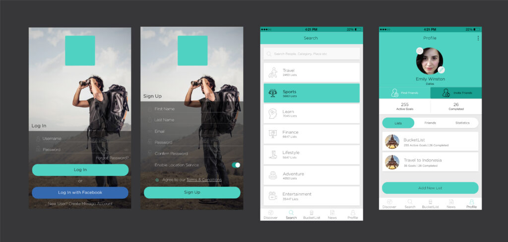
There are design software and tools for creating mock-ups. But, at Copper Mobile, we make the prototype from scratch by coding without any tool or software. Here’s an example of some of the early designs of the app.


The mockups should be open for feedback and experimenting before it is pushed to development. After final touches this is what the final design looks like. Once the design is ready and approved by the client. You can move towards the development side and start coding the app.
I hope this post gave you a fairly good idea of how to go about with designing an app will help you get started.


