According to a detailed report on ‘E-commerce in the United States’, about 82% of Internet users prefer a mobile device to shop online. The report also confirms that the conversion rates from M-commerce applications are three times higher, with twice as much spending, as compared to E-commerce websites.
Moreover, E-commerce expenditures in the United States shot exponentially from 207.2 bn USD in 2018 to 338 bn USD in 2020. Experts estimate that the numbers will eclipse up to 420 bn USD.
The numbers are evidence that E-commerce applications are changing the way people shop. Unlike earlier times, users wanted their purchases quickly. As a subsequent series of events, E-commerce businesses were pushed to develop their mobile applications.
“Mobile Commerce” or “M-Commerce” came up out of nowhere, as a natural progression of E-commerce. These applications became the new ‘go-to’ for purchases. People are willing to wait for their purchases to get delivered, which wasn’t the case in earlier times.
What became important for retail businesses to sustain in the hypercompetitive industry was to ensure standing out from the crowd, however, even after multiple attempts and numerous design iterations, businesses battle with low engagement and retention in their apps.
The reasons could range dramatically from improper planning to failure in the user-friendliness in the application. However, mostly, the reasons are some common mistakes developers make while building a goldmine for E-commerce businesses.
In this article, we cover some of these mistakes that you can avoid while developing your M-commerce application.
11 Common Mistakes You Can Avoid When Developing a Mobile App For Your Business:
Here are some common mistakes you can avoid to give a competitive edge to your business.
1. Developers not Respecting the Medium

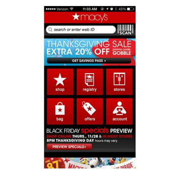
One of the major aspects you can focus on, is to respect the medium you’re using. Treating your M-commerce application as a miniature version of the E-commerce website only leads to a decline in user experience. This means unnecessary trade-offs and a significant impact on sales.
Consider Amazon. With over 100,000,000 downloads, Amazon became the number 1 app on Google Play. The fact that Amazon ensured an optimum mobile version of its business makes it stand out in the crowd. Features like quick search, million reviews, product details, and easy navigation make customers choose it over other apps.
2. Lack of Personalization:
Another common but critical mistake you can do is to not personalize your M-commerce application for your customers. You need to build a connection with the user and create a seamless user journey model. Irrelevant engagement lowers your conversation rate, and thus affects your business as a whole.
Features that remember your previous searches suggest your products based on those and offer easy navigation are something you should focus on. In addition to these, highly personalized mobile notifications and emails are crucial for increased engagement response.
3. Low-Quality Product Images:
Another common mistake you can do while developing your M-commerce application is to not invest in a high-quality photoshoot. Product photos have a significant impact on the overall user experience, which directly impacts the conversion rate.
We suggest you go with HD quality pictures with white background, clicked in multiple angles along with a zoom feature embedded in your app. Also, you can supplement your product photos with creative photos of the product in use.
Note – While you include HD quality pictures, you need to be mindful of your response time.
According to research from Google, bounce rates on mobile sites increase to 32% as page loading times go from one second to three seconds. The probability of a user bouncing to another app/site increases by 90% if that loading time reaches five seconds and 106% from one second to six seconds. You need to minimize the response time of your application by keeping the resolution of your photos in check.
4. Making The Home Page Cluttered With Too Many Features:

A cluttered home page with many features acts as barriers to browsing. Your focus should be highlighting the critical elements for your E-commerce business and pushing the ones that are just occupying space. Here are some features that need most of your attention:
a. Signup walls (lack of guest checkout): It can be highly problematic for your app engagement, in case your users can’t purchase a product without creating an account.
b. Limited payment options: A limited number of payment options can be another problem for your sales.
c. Shipping and billing information: Redundant information, or typing shipping and billing information twice before checkout increases interaction cost.
d. Infinite scrolling: Using endless scrolling instead of pagination on the product list page can affect user experience. Users should be able to save a current position in their scroll and continue the journey on another platform.
5. Turdy/ Difficult Checkout Process:
Your main goal while developing an easy-going M-commerce application should be to reduce function, assuage doubt, and reassure the customer of their choices. Complicated checkout processes or multiple checkpoints to place an order makes customers not want to order at all.
Making the checkout process easy for your customer (even the guest users) involves the following steps:
a. Don’t show your checkout process all at once: The golden rule is only to showcase the features relevant to the user at the moment. Roll up everything else, and make the process of reaching the next step very natural.
b. Do not hide what’s in the customer’s cart: Make sure your users can see what they want to buy. Allow users to change the quantity of each product right there at the checkout.
6. Essential functions out of thumb’s reach
Larger screens of the latest mobile phones dictate the way users navigate their phones. An increased manipulation of the screens with one hand makes it harder to access areas further out of your thumb range. You need to bring the search down closer to the thumb for most apps.
7. Ineffective search feature

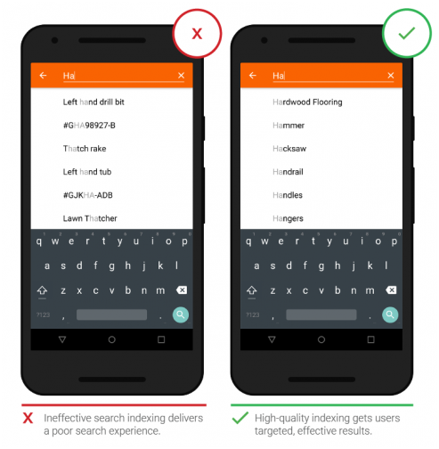
Another common mistake is developers not paying particular attention to the search feature. Its impact on conversions is often underestimated. Ask yourself questions like- is your search feature enabling users to discover new products? Is the auto-fill working correctly? Does it allow users to find what they are looking for quickly?
8. Lack of intuitiveness:
Lack of intuitiveness in your M-commerce application leads to inconsistency in user experience. Simply put, you need to make your navigation easy enough for a three-year-old to take at least one action from your app.
9. Setting an unrealistic budget:
Setting a non-realistic budget is another common mistake that people often make. An ideal M-commerce application requires you to hire a team of developers, designers, and marketing experts. Thus, expenses involved in the development process need to be in line with your requirements. Make sure to discuss your first features, business logic, and objectives with the team of developers before finalizing the budget.
10. Not developing a cross-platform strategy
Advancements in technology make it imperative for businesses to use a cross-platform strategy. Developers use cross-platform app development tools to deploy a single source code on multiple platforms. Be mindful of the drawbacks of developing a cross-platform mobile application, and you’ll be good to go.
11. Lack of a marketing strategy
A lot of M-commerce applications battle with low user engagement despite thousands of dollars spent on its development. Not taking out enough time on your marketing strategy is another common mistake you can do. There’s massive competition in the app stores. With thousands of apps getting released every day, it’s difficult for your app to make a mark without a thoroughly thought-out marketing plan.
All in all, an M-commerce app can turn out to be a goldmine for a business. The process of development is thereby going to be one of the most significant investments for your company. You must partner with industry experts to develop a trustworthy and top-notch product. Ensure that your app development company has an in-depth understanding of the business logic, and you’re all set!


